GoPass App
GoPass is an integrated payment system for public transport in India
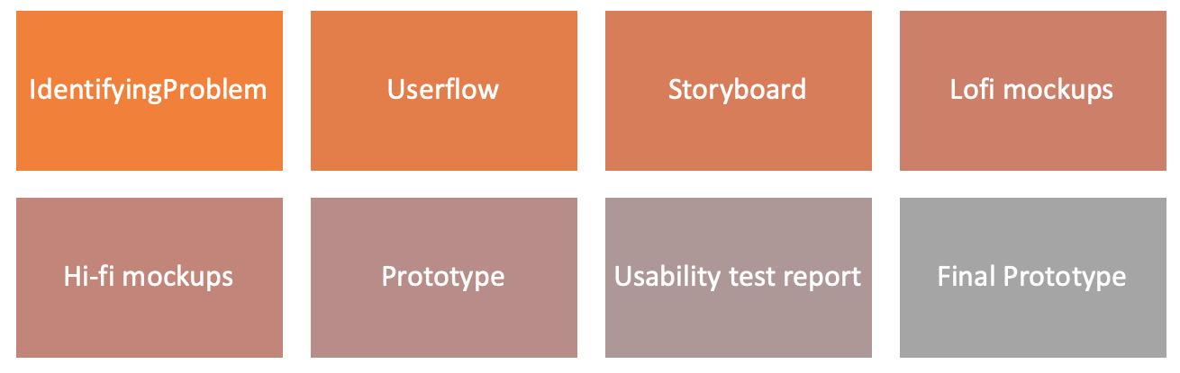
Design Process Overview
Problem space
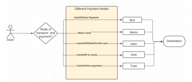
Existing Problem with payment system in public transport
User Flow with existing problem
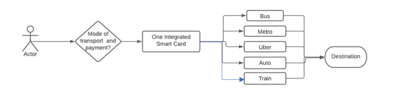
User flow with GoPass Solution
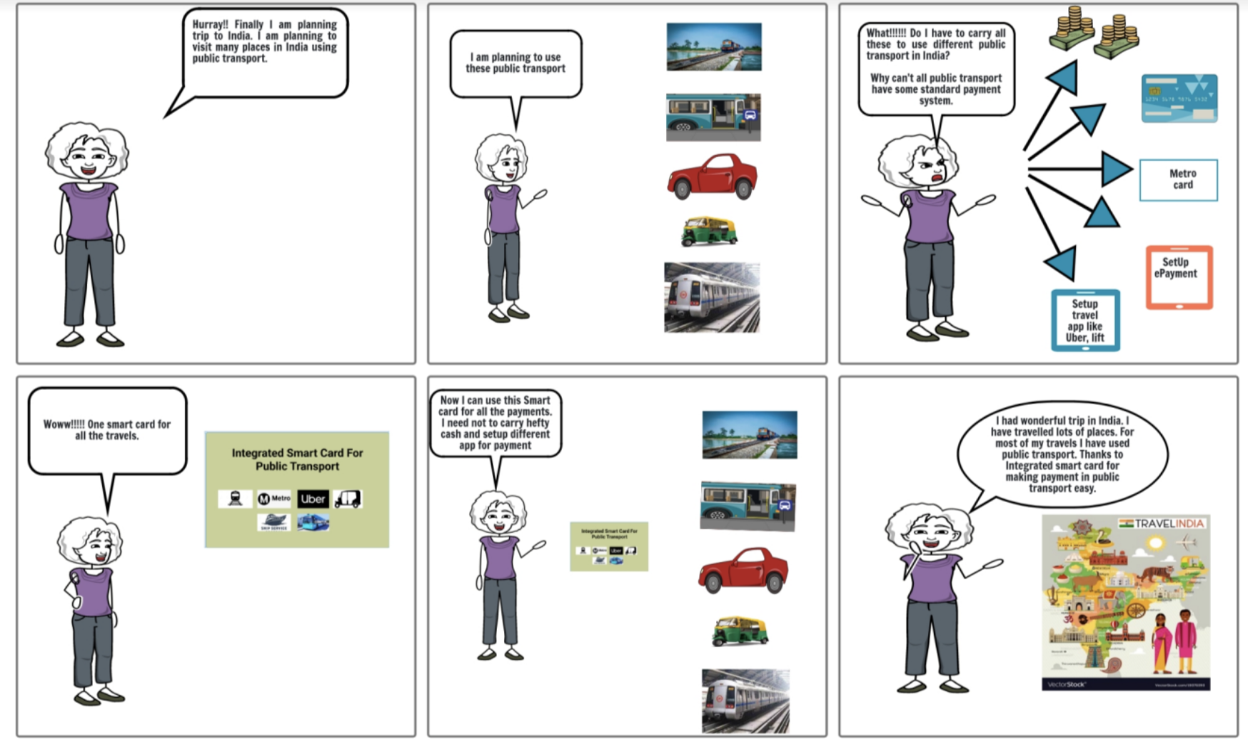
Storyboard
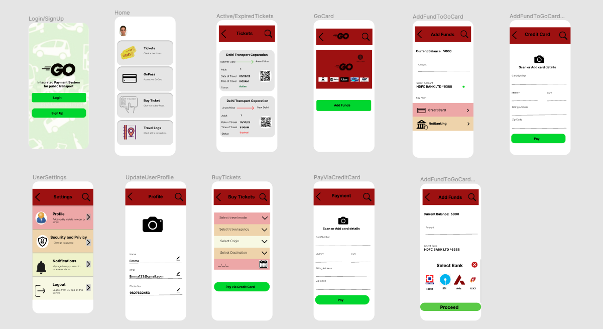
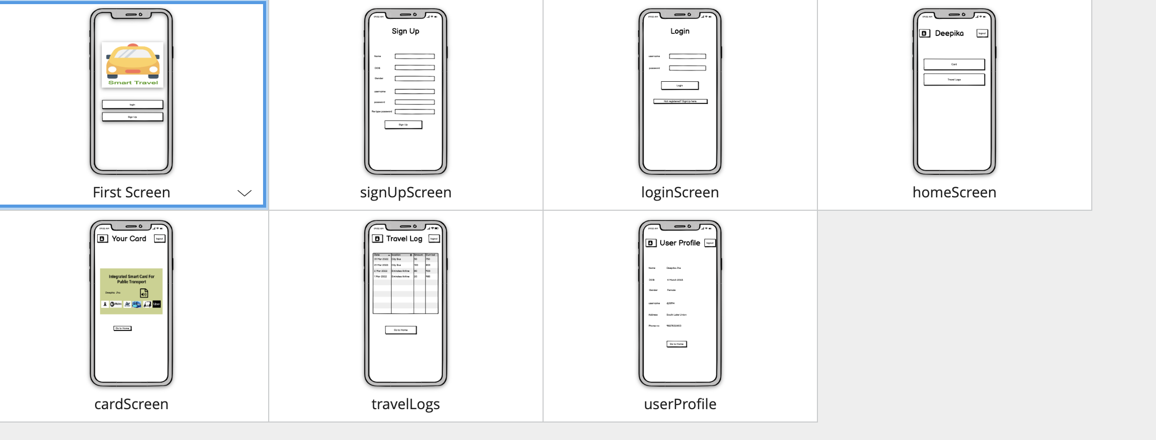
Lo-fi mockup(v1)
Feedback recieved
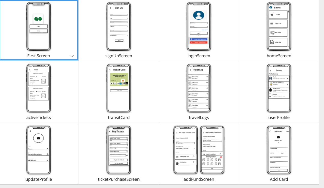
Lo-fi mockup(v2)
UI Fixes
Hi-fi mockup-v1